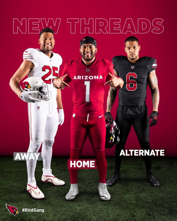
It is a very very real problem that I can go on my Instagram explore page right now and find at least 50 mock Cardinals uniforms better than the ones they just released.
Tell your uniform designers to get it together!!! Or let us submit uniforms for you, minor league baseball team name style.
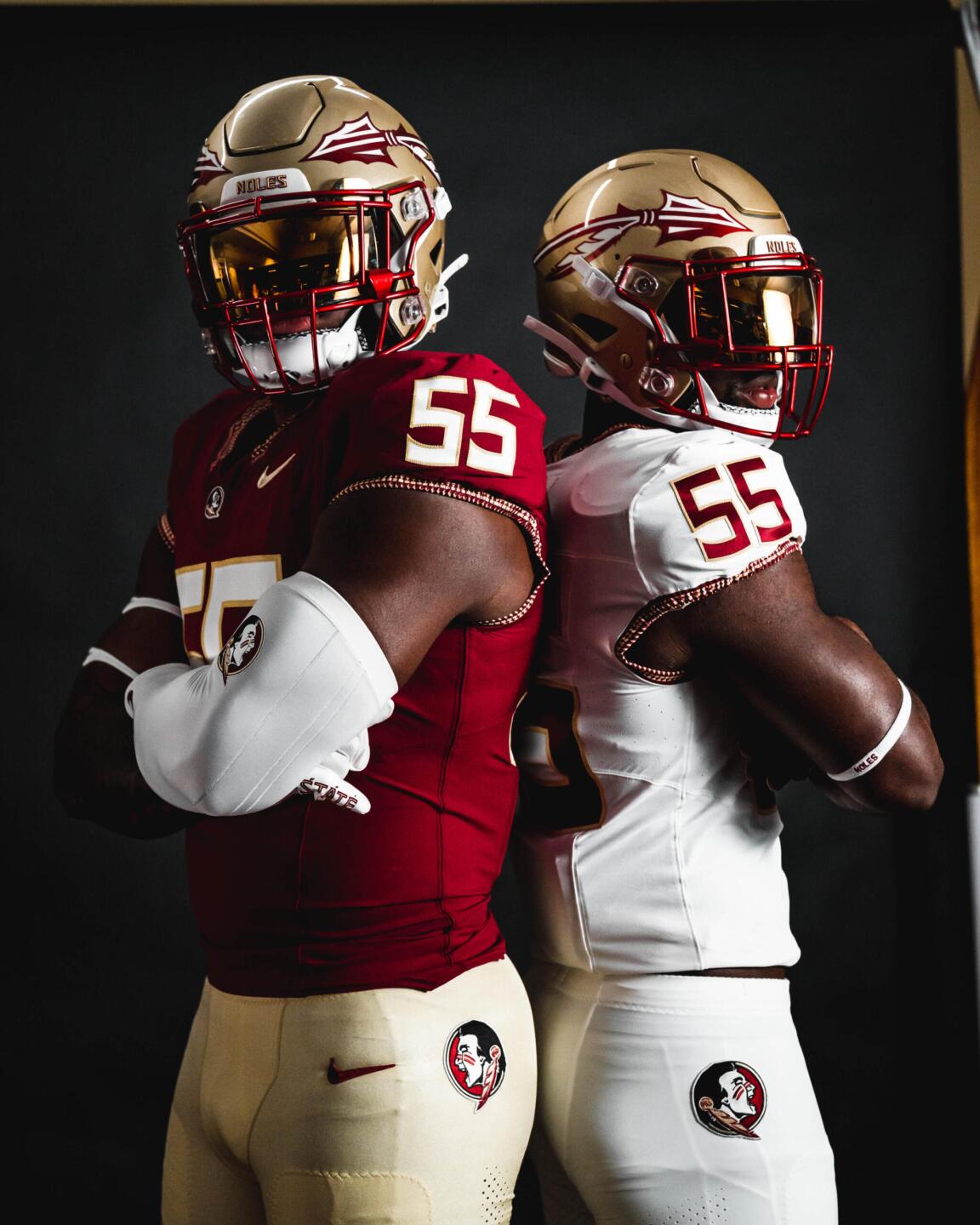
Its a “back to basics” look that i appreciate. Florida State is doing the same thing, getting rid of the weird tribal print thing they were trying out.
Its just the very edge of the sleeve now. I agree with you that the Cardinals are very plain. They should have thrown in a few details like FSU. The Cardinals design mails it in. And I bet they will sell the idea that putting ARIZONA large across the front is a big deal since it is not typical of NFL teams. Some have a name, many do not. But even the ones that have names don’t typically have it that large.
I agree with Grossi’s video comment on their black jerseys. First thing I thought when I saw them was “Why does that look so familia…. OH” and my brain kicked in and replied “IO”.
They are a straight copy from OSU. I agree with the comment above, to me it looks like they ripped off OSU and Oklahoma together. I guess they figure if they are going to play like a college team on the field next year, may as well dress the part too.