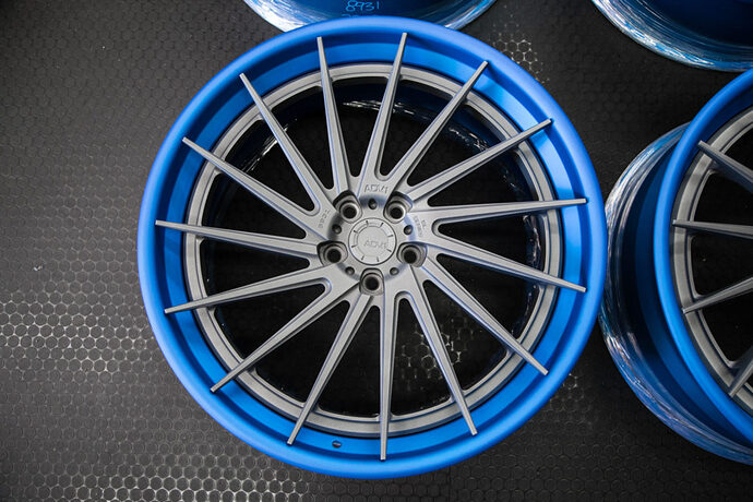
Would you consider some of these logos?
100, 011…Gonna need more gummies.
For me, the logo is fine. Slightly darker blue unis, no stripe on helmet, old school block numbers, and lose the Lions and WCF on the sleeves and the crap font in the lettering. Basically, the Sanders/Spielman era Lions unis with a small tweak or two.
So you would keep logo on helmet but remove middle stripe?
Because of Detroit history with the automotive industry, I’d have the new logo in some sort of emblem
Yep.
Give me the 1995 unis.
I would be happy with that…
The logo and colors are fine. We want WHITE BLOCK NUMBERS on the home jerseys. Not gray numbers!!!
I never knew according to history, the Lions wore all black uniforms. Probably one of the first teams to do so
Let’s cut the BS, the clear winner is this one:
Removing the stripe is a very slight visual advantage because defenders are taught to watch the stripe on the QBs helmet to help identify where he’s looking.
I absolutely hate the idea of changing the team colors. I hate the Giants blue. It is boring as fukk. There are so many blue teams we have to be different to maintain identity. And we have the best blue.
Cool pic but wouldn’t change anything

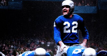
Yeah, I think this is a colorized photo but this is not Giant blue. Lighting plays a role in what the colors look like. I think the LED lighting in Ford Field is a touch miscalibrated.
Layne looks badass here.
But I do prefer the traditional lighter blue ultimately.
Here are the codes in case people want to paint their fence and kids Honolulu blue.
HONOLULU BLUE
HEX COLOR: #0076B6;
RGB: (0, 118, 182)
CMYK: (100, 45, 0, 10)
PANTONE: PMS 7462 C
Today the Honolulu Blue looks lighter. I hope we go back to a darker Honolulu Blue and metallic/silver. The 2 contrast makes the uniforms pop imo.

