Hopefully no all black but blue pants. Like that.
I agree! Detroit and Lions on uni is like having WCF on it
To me, this is all they could’ve done without appearing cartoonish. TBH, the prior typeface was a train wreck. No, it didn’t make them appear “faster,” it ruined a legacy brand is what it did.
This is a return to tradition.
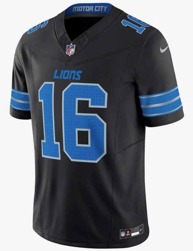
Could do without the black but not concerned either. Only thing I’d wish they’d include would be “313” as an option for the neck label.
This is a fantastic pairing with a winning football team in Detroit.
10 Likes
I love these. Classic look that can stand the test of time. Have to see how the helmets and pants turn out, but these are a big thumbs up for me.
2 Likes
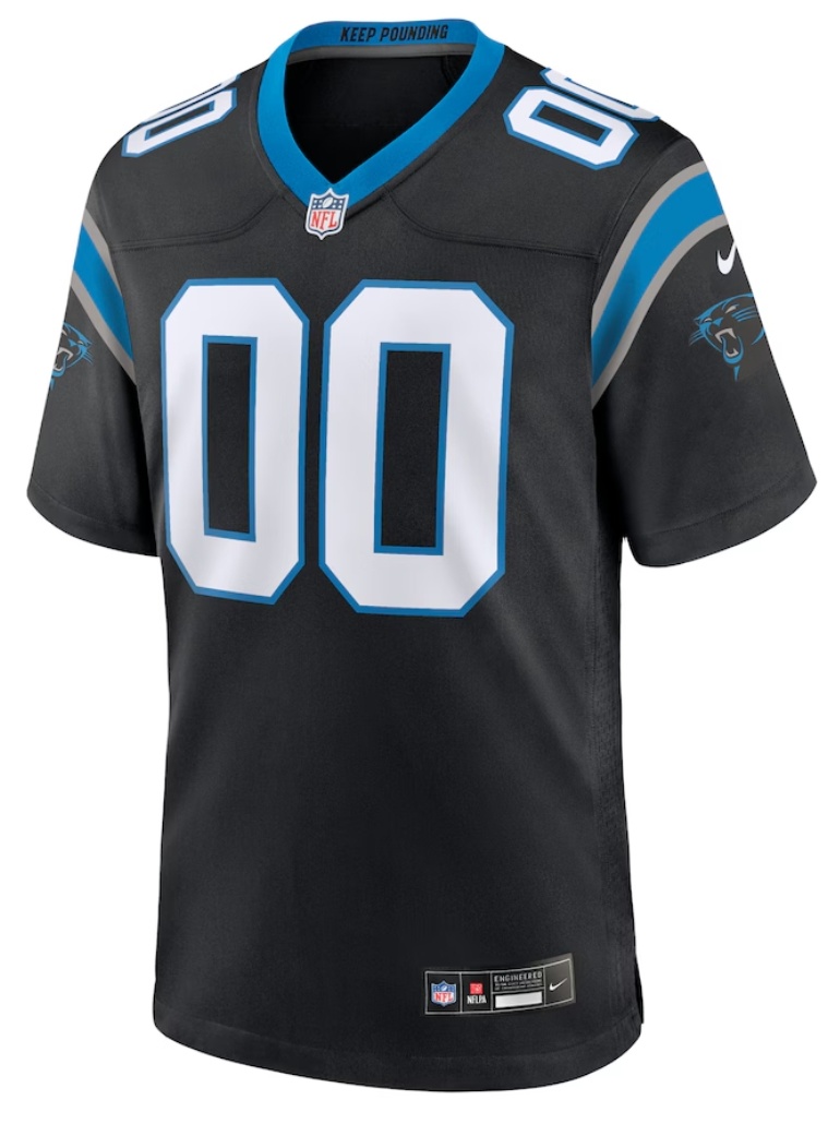
Panthers and Lions black side by side. One concern I had with black jerseys is that we’d look the same as every other team with black jerseys, but the blue numbers and silver detail make it look different enough, so that’s good.
2 Likes
Hate the black. Not unique. Elicits immediate memories of Matt Millen’s malignant mismanagement.
2 Likes
Unpopular opinion that won’t come true anyway: I wish they would bring back the rorschach lion
A player on the 0-16 team just led us to the NFC championship game. I feel like Dan Campbell has negated the Millen years by not just playing a role in 2023, but the decisive figure.
I get the sentiment. But Dan has washed it away. For me, at least.
2 Likes
Excited to see the pants, helmets and throwbacks.
That should solidify my opinion.
As of now, I love them. But the pants and helmets should bring everything together.
1 Like
- I said…

- OMG THE WCF HAS BEEN DROPPED!

- Haters gonna hate but they look GREAT!

2 Likes
White numbers away from being a Carolina Panthers jersey
3 Likes

2 Likes
Do you like the black jerseys?
- Yes
- No
0
voters
Want all 3
1 Like
Like the numbers better on the new jerseys. The others are too elongated.
1 Like
The best thing about this is that its Alim. We have every intention of keeping him after all.
4 Likes
Give me the blue facemask or give me death
3 Likes
That’s part of the good news. It’s Sheila’s team now.
4 Likes
If those are the jerseys and from all indications they are. They are overhyped to me.
To quote Dom Deluise in History of the World Part I: “Nice. Nice. Not thrilling, but nice.”
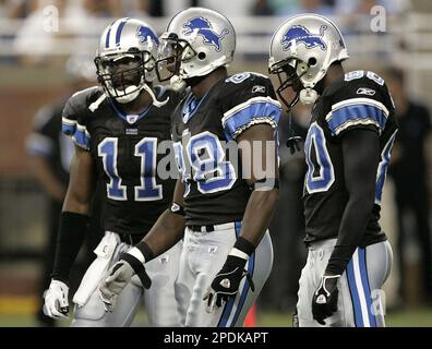
In terms of black jerseys, I prefer the Millen era ones:
The new flat black ones are blah.