So whites will have blue pants, blues will have grey pants and blacks will be with black pants?
I would dig a grey stripe on the black pants.
So whites will have blue pants, blues will have grey pants and blacks will be with black pants?
I would dig a grey stripe on the black pants.
Love the clean look!
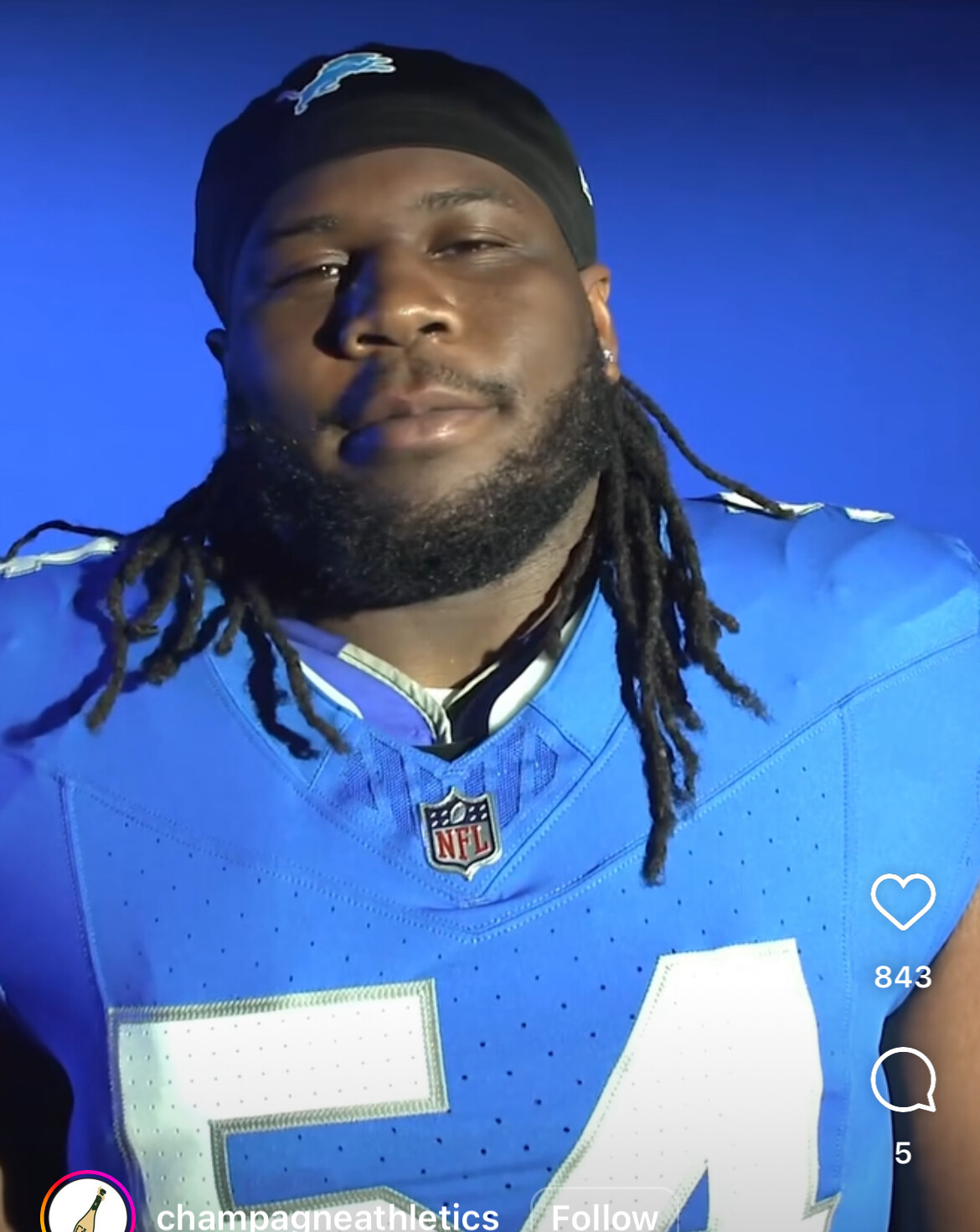
Its their traditional 1957-2002
Ok with the black!
But clean strips,
Clean BLOCKY! numbers
No extra colors.
This. Black is some other team’s color.
thank god we avoided the dick leaking allegations
There’s people on mainstream Instagram that are so stupid to the point that they don’t see any differences.
I prefer the grey numbering more than the stark white.
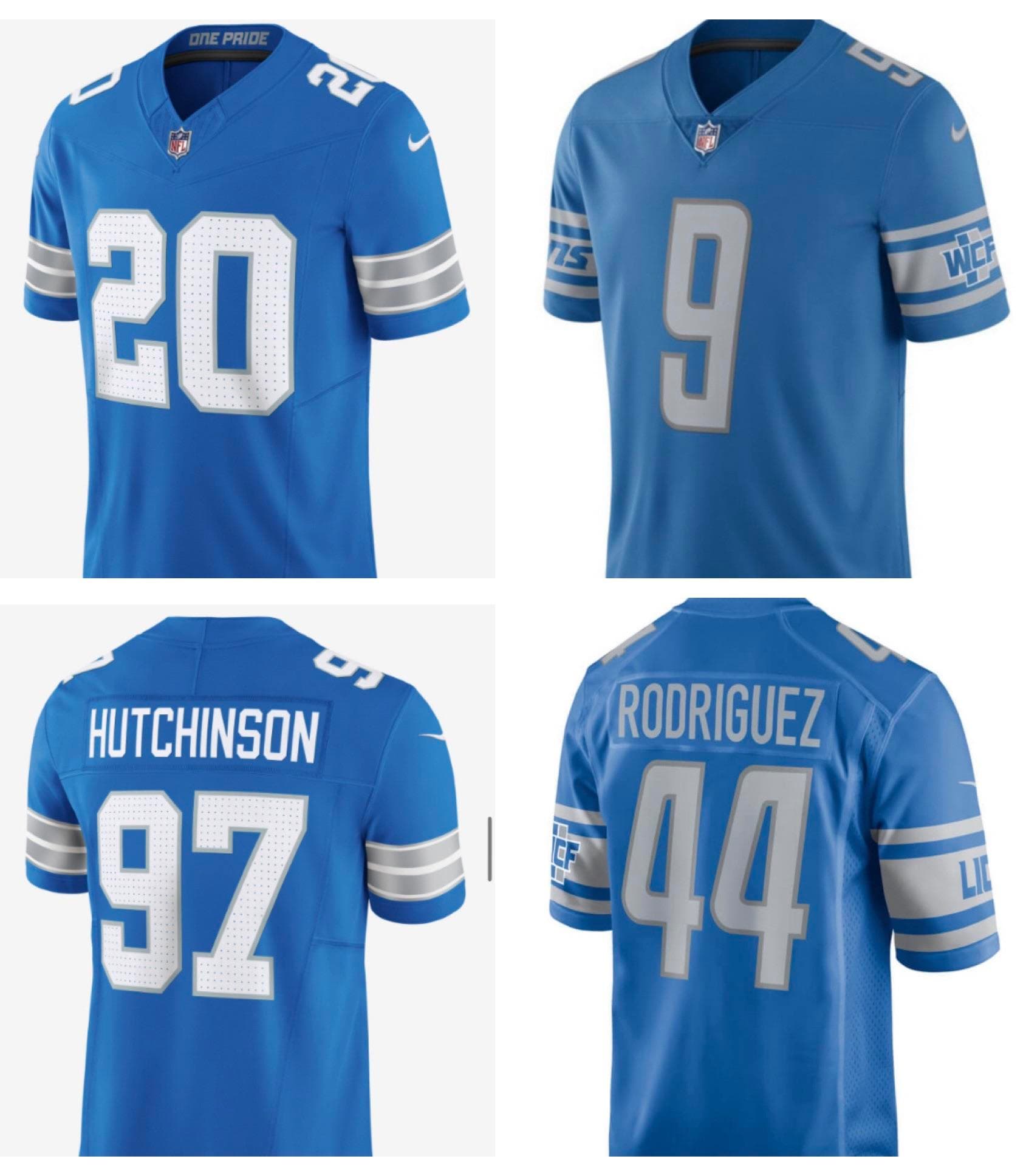
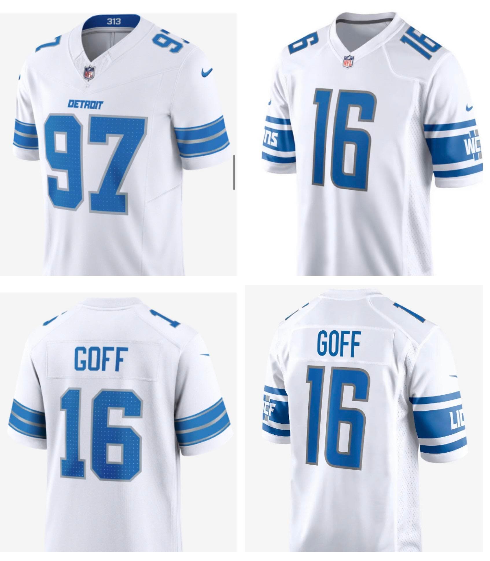
313 in the collar of the whites, motor city in the collar of the blacks, in the blues “one pride”
At least now we can read the numbers. That’s a nice change.
That kind of news comes in drips
The ONLY thing I don’t like about these is the patterning inside of the numbers. Don’t think that’s really necessary.
The inside of the numbers pops better on the old jerseys because they’re solid inside.
Now this is useful. Love the blues.
Well done Lions! Major upgrade in every way for me.
Helmet and pants combinations will be interesting to see.
My hope is the black jerseys will be more gun metal gray.
Overall quite happy with these.

I think the blue is too dark to contrast with the black properly. It’s just gonna look like a muddled, dark mess on the field. It’s not egregious like the Ravens jerseys, the new Jets alternates, last year’s Colts’ atrocities, etc… but it’s still not great.
So you’re saying that Refs might call a violation based off of a misreading the number of a Jersey? That’ll be a new twist.
Blue: 10/10 - I really like it, the sleeve hoops look great, the silver being silver rather than grey looks great, and the white numbers make the whole thing pop a whole lot more than the grey numbers did. This is great, as Rod Wood said it’s the classic look but with a modern twist and they’ve pulled it off. If the pants are genuine silver too then it might even be 11/10.
White 8/10 - Would be perfect but for the stupid “DETROIT” that is just unnecessary. Credit for incorporating both traditional colors, and you can really see a difference between the grey and silver number outlines on the side by side picture of old and new.
Black 7/10 - Again with the unnecessary “LIONS”. I was never too enthused about black as a color, but credit for not making it look much like the Panthers black jerseys, they have white numbers whereas the Lions blue numbers should distinguish them.
Essentially the same uni with a few tweaks…Like Wood said…This could have been in a week tho
Honestly the Lions should put chips in the Jerseys so that when the player walks by the zebra a robotic voice activates,
“I am Taylor Decker. I am number 68. I am reporting as eligible.”
Let’s leverage technology here.