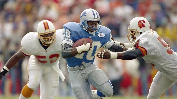
They better have. Best jersey in the NFL.
I hate detroit name on unis if this is true
I like the white number, its closer to the later 90s look. here are both for reference, i prefer the white but think they both look good
Home and away are fine, the black/alternates are…why?
the silver outlined in white makes the number pop more imo. Besides, Honolulu Blue and Silver is their color
I think so too
I’m glad they went with the white numbers. The silver number look is kinda gross.
The best part of all…
NO WCF!!!
until you see the pants…stripe is replaced with a big WCF down the side.
Honestly, I could have came up with this design in 2 weeks…Not sure why it would take nike 2 years
from what i’ve seen its a more of a metallic dark gray, could look amazing in the sun. All good for alternates though.
The home and away ones are great. The black ones are helpful. Now at games youll be able to see exactly who the drunk fake tough guy aholes are.
Since they’re bringing real silver back, I hope we get some nice silver pants.
These are actually SO nice. No need to change these…maybe ever.
Yep. This is exactly what I was hoping for with the home and aways. I can buy into the black because they didn’t ■■■■ those two up. Black might not look bad with that new helmet and black pants.
And you guys upset about the black/steel jersey…
Alternate jerseys can be replaced over time without the whole set getting replaced. The Seahawks did that last year. The Eagles might’ve also did that with their black but I can’t remember.
I’m just glad it’s not Dick’s that’s leaking
Or a black helmet?
Remember, we can have three helmets now because we’re changing uniforms this year.
Don’t rule out a third helmet coming in.
The blue throwback helmet can be worn with white on occasion. I think that’d be a really good look.


