I still love this logo. It was the one on the side of the little plastic NFL helmet collection I had as a kid. But I always saw it wrong. I thought the space between the arm and the chin was the eye and the arms were like a big goofy mouth. I thought it was just a strange ugly lion witn a weird misshapen face
That’s a perfect example of a design concept referenced earlier. A Logo should “read” easy. Shouldn’t confuse, which the 1970 version does. Where the paw abutts the jaw is a problem. It’s improved in 2009 version where they added white interior strokes for mane, eye and to refine head shape. 2009 logo is quite nice, IMO.
In 2017 they updated it again, but only real change was to make the outer contour stroke grey instead of black. That change gives the logo a nice glowy halo.
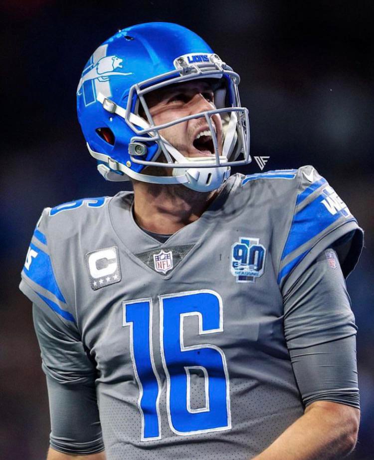
To me I think the excitement about the new helmet is split. On one side you have some that love the throwback logo and will deal with the color bulllshit. And then there are those that love the color and will deal with the logo bullshit. And those in the sweetspot who like the logo AND the color of the helmet have decided to deal with the color of the grey uniform bullshit.
As you said, noone is completely happy and everyone is hoping for something different in the future and noone would ever want to see the 2023 situation become the new standard helmet/uniform.