I just asked the youth demo what he thought. He responded with “fire.”
Sorry fellow grumpy old men, you have been outvoted by the demographic the marketing team actually cares about.
I just asked the youth demo what he thought. He responded with “fire.”
Sorry fellow grumpy old men, you have been outvoted by the demographic the marketing team actually cares about.
This is exactly what Rachel said to me, man. hahah! Agreed.
Also → is it just me, or is that a darker gray?
Are these the same gray pajamas, or are the gonna be darker?
I wanted matte paint…and i got it…so that makes me happy
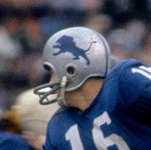
I wanted a look that isn’t flashy and pretty, but instead says”we’re here to kick your ■■■■■■■ ass”. I feel like i got that too (in the helmet anyway).
COMPLLETELY agree w/you on the color scheme of the uniform
You are correct.

Fugly. Absolutely hideous.
Like the color hate the logo!
Pretty sure that’s the original lions logo isn’t it?
are you sure about that? i seem to remember the leaping lion before 1970?
Same! Now win some playoff games and I’ll like them a lot more.
If we are gonna wear the ugly gray pajamas then gotta go with black helmets, socks , everything and then use that blue from the helmet for the logo and to accent everything.
Kinda like a sweeter version of Jax
Its def from the past. whether its original or not, you have to ask someone even older than me!
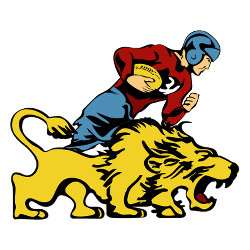
yeah - 1961 had a leaping lion:

Don’t mind the helmet, but with the gray uniforms? Ick is right.
Have never liked the gray uniforms.
Lions fight song includes
Let the blue and SILVER wave
Not the blue and gray
Emily Griffin, the Alissa Heinerscheid of helmets.
yes - truly silver uni’s would rock.

Original logo is a little dated. I like the ‘61-‘69 logo.
Not a fan of it and certainly don’t like it with the grey uni’s……
Two ![]()
![]() from me
from me
F[quote=“HawaiiLionsFan, post:78, topic:24240, full:true”]

Original logo is a little dated. I like the ‘61-‘69 logo.
[/quote]
Flash and a Lion?
Grey is Michigan’s six-month winter. Whereas silver is for “lining”. Get it?