Should be interesting …
2 Likes
I hope the changes aren’t too drastic or ugly.
2 Likes
Just say no to black. We aren’t the Panthers ffs.
2 Likes
As close to the throwbacks as possible please.
4 Likes
Please have a black alternate uniform. You don’t have to wear it more than once a year, but it’d be so cool.
And don’t do anything gimmicky. We’re not here to be flashy, we’re here to kick your ass.
Except when we’re wearing black of course, then we’re here to do both.
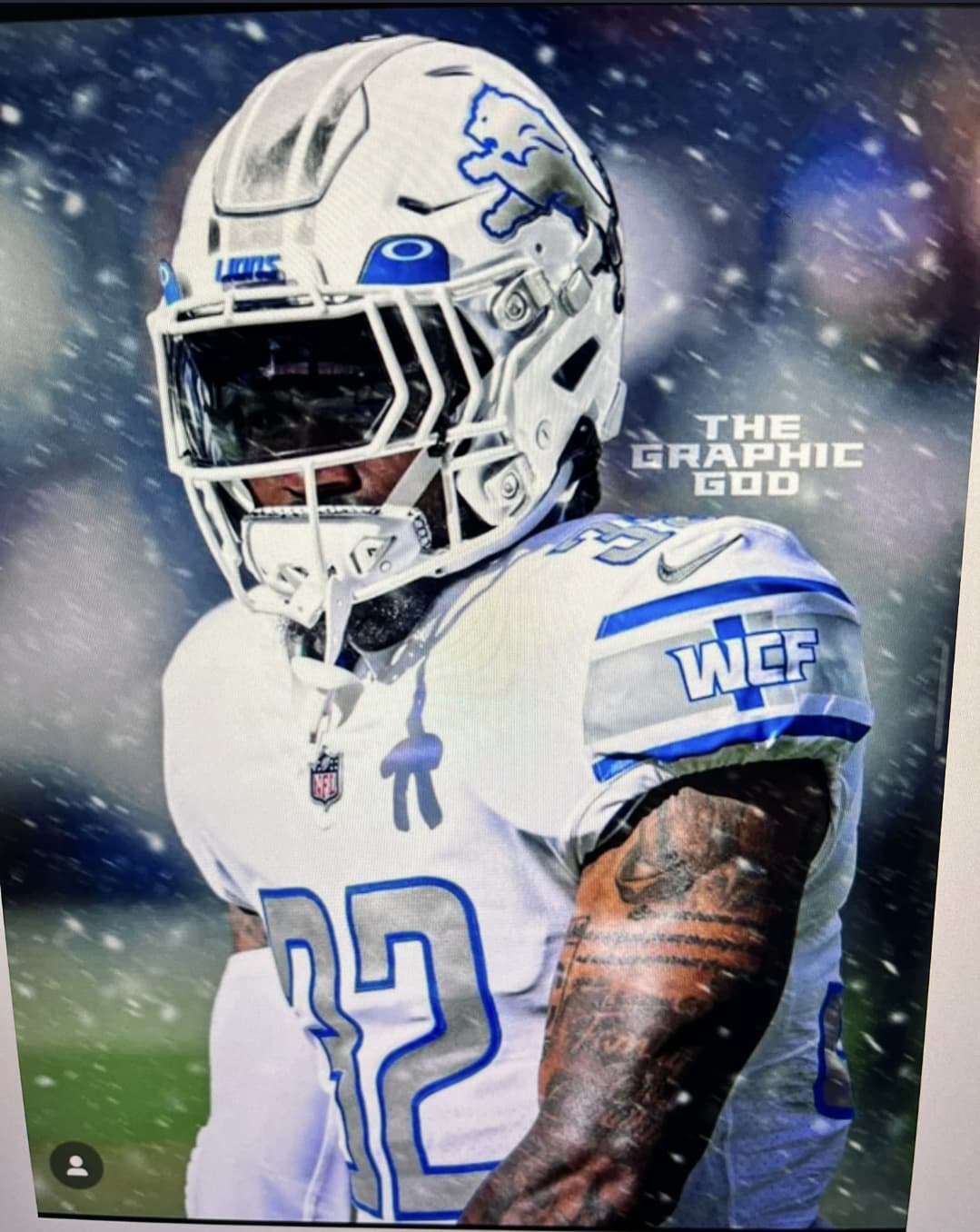
Something like this but obviously Lions themed…

1 Like
The tails are gonna look sweet
No, the Michigan Panthers won championships.
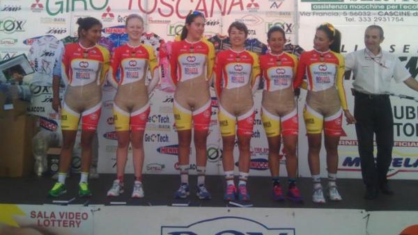
As long as they didn’t get input from the Columbian womens cycling team …
3 Likes
I just hope they’re moving away from the typeface, which influences the jersey number. It’s ugly. Looks like something you’d find in the Premier League (that’s soccer, for you following along at home) than an NFL football jersey.
2 Likes
I really like our jerseys the way they are except when we wear the grey pants.
Me and DC have similar tastes because I really love the “color rush” style he’s been implementing so frequently where we go blue top- blue bottoms or white top- white bottoms.
hopefully that becomes more of a staple of the new jerseys.
No grey pajamas.
2 Likes

Roar!

2 Likes
Also please have white numbers on the home jerseys. The grey numbers make it look like crap IMO.
3 Likes

love love love it
3 Likes
@Thats2 not bad.
1 Like
For the record I didn’t make it, found it on Twitter awhile ago and screenshotted it. I would give credit to whoever did it but I’ve long lost the tweet, though I suppose their tag’s right there on the photo.
They have to change the font the numbers
4 Likes