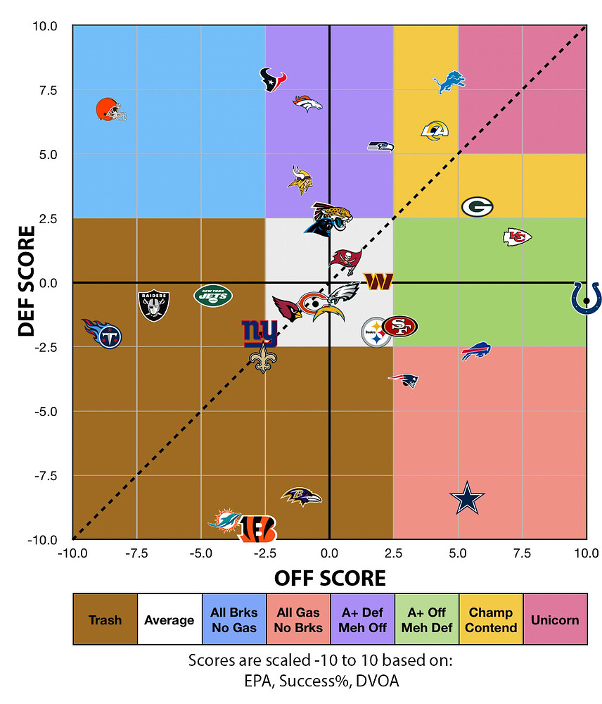
Week 8 Chart
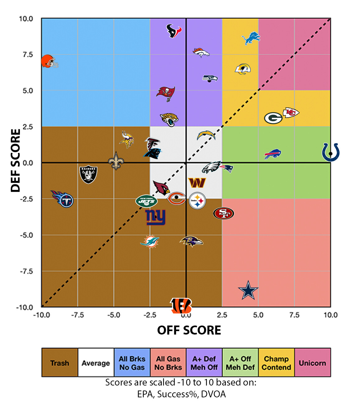
Heres week 7 as a reference
DEN, KC, TB, BUF, BAL, NEP, MIA, all improved
MIN, CAR, ATL, NYG, SFF, PIT, WAS got worse
Great job, did you do this yourself? I love to visualize data - puts things in perspective.
As an engineer I approve of charts and charting. But I really dislike this style of charting. I feel like I must be in the minority on this since everyone does it.
Thank you. And Yea. I have a calculator that automatically takes the above and blow averages for each stat to place them on 0 through (-/+)10 and averages them out.
Puts it into the chart. Then I manually add the logos on top.
Reposting from the other thread.
The chart suggests 8 teams from the AFC for the playoffs, but we know there can only be 7. So one of those “pretenders” from the NFC is gonna get in. There’s a lot to choose from. The Commies probably have the best shot based on the metrics, followed by Falcons and Panthers. Ugh.
Better to be a #2 seed in the NFC than the AFC.
Good shit, holmes.
So, DVOA is a % above or below the average. You area also using EPA and success % if I remember right from the other thread. So since these are based of NFL averages, what I would be interested in is an overlay of teams records on this chart. Would be interesting to see how the records line up with your calculations
Yea DVOA i adjusted to max 10 min -10 and 0 average.
Same with EPA and suc%
Is this chart full season through week 8 or individual for each week?
Full season. Through the most recent week.
Very cool.
Here it is with the outline color is the record
Red - .800+
Orange- .700+
Yellow - .600+
Green - .500+
Teal - .400+
Blue - .300+
Purple- .200+
Pink - under .200
This topic was automatically closed 90 days after the last reply. New replies are no longer allowed.