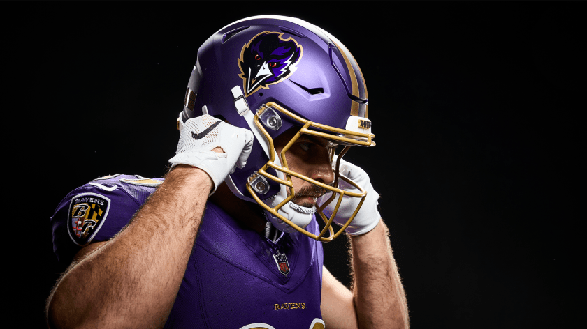
Pretty cool looking.
2 Likes
I like the color but the logo looks like they just slapped a sticker on there
8 Likes
Logo looks more like a cute Raven than a mean one.
1 Like
teams should really work the helmets so that the shape is molded into them.
1 Like
I never liked the cartoon-y bird they went with. I prefer a more stylized one like the Falcons use. I’ve also never been a big fan of their purple and black color scheme, the colors don’t contrast enough. Black looks best when contrasted with lighter colors.
1 Like
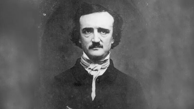
Not even joking, that was a missed opportunity.
To those who don’t know why they’re called the Ravens, Poe was from Baltimore and his most famous poem was The Raven.
They could have gone with an image based on this photo.
2 Likes
Yea ultimately though they destroyed us last year…so the logo appears to work ![]()
1 Like
The logo could be better.
1 Like
6 Likes
looks cool…next new logo?
Yeah, not really liking the front facing logo. I had to zoom in to see exactly what it was.
Good point. That would look awesome. Great suggestion.
They’re not Disney… Iykyk
1 Like

I completely agree. Can’t believe they got rid of the best one.
1 Like
Couldn’t disagree more about the one and done… Like the matte blue, hate the logo, good riddance
The Matte blue is awesome. I like the classic lion but think the current would have looked fine as well. I also really like @Sheepish idea to use the molding into the logo.
I have a 3d printer I’m going to try and put something together and see if I can print a sample of something like what I’m thinking.
Yep, similar to the sticker we have on our helmet.
Man, I really liked that one. Hope it makes a comeback some day
1 Like