Sounds like you really had it figured it out as a kid. Any idea what happened?
1 Like
Oh man… how many years do you have to listen?
1 Like
I am not even sure you could play the original screen cut today. Like you can watch shows with people walking around naked dropping F-bombs and N word. But that movie would put people on tilt.
The original was a classic work of art.
1 Like
In no particular order:
The current Lions logo. Favoritism aside, I think they knocked it out of the park. Looks like a modern interpretation of something you’d see on a piece of medieval heraldry. I love it.
Saints Logo: Fits the city brilliantly and is timeless.
Seahawks: Don’t know why but I think it’s awesome. Love the flash of neon.
Non NFL all time best ever? Brilliant use of negative space. Awesome design.

2 Likes
I’ve got Bad News for you…
2 Likes

I haven’t slept with his Grandma
Yet
3 Likes
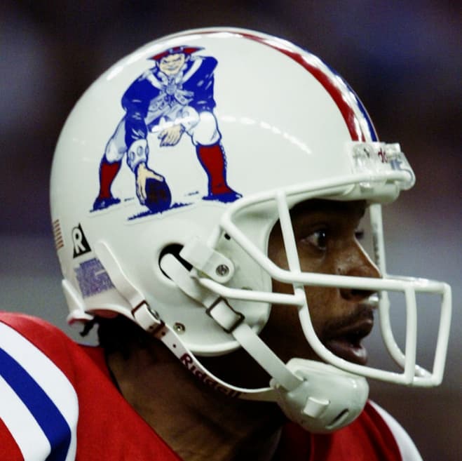
Houston Oilers
Houston Oilers
Houston Oilers Number One
2 Likes
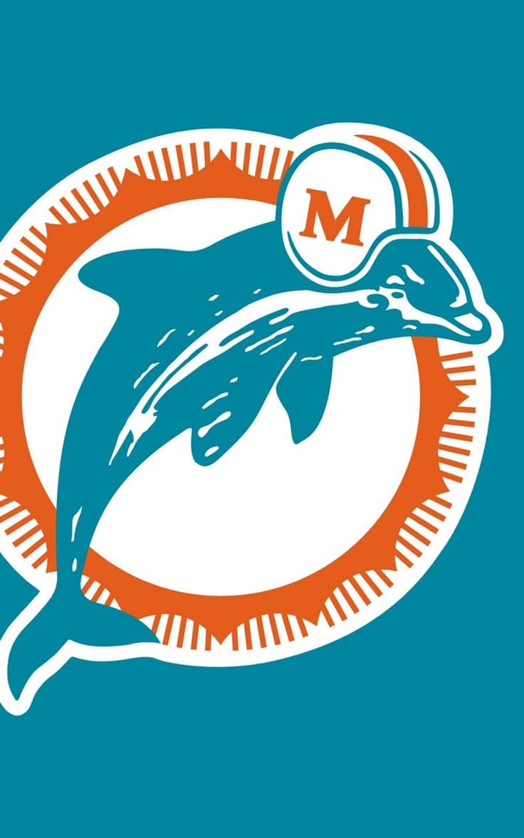
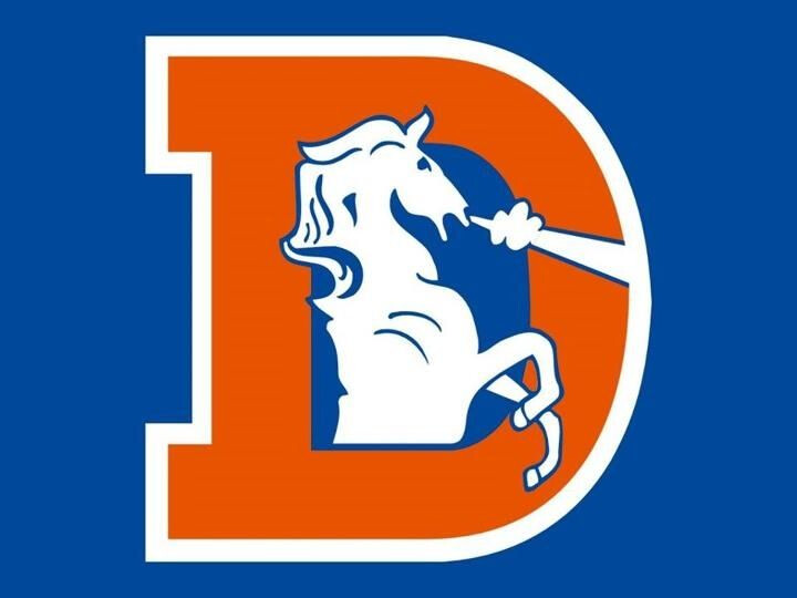
I’m with you @Tmanqz on 2 of the three. Gotta go swap out the skins for the old broncos or old dolphins though.
2 Likes
lions logo is my fav by far. all the other ones SUCK
3 Likes
Yeah me too
So many goats in this thread
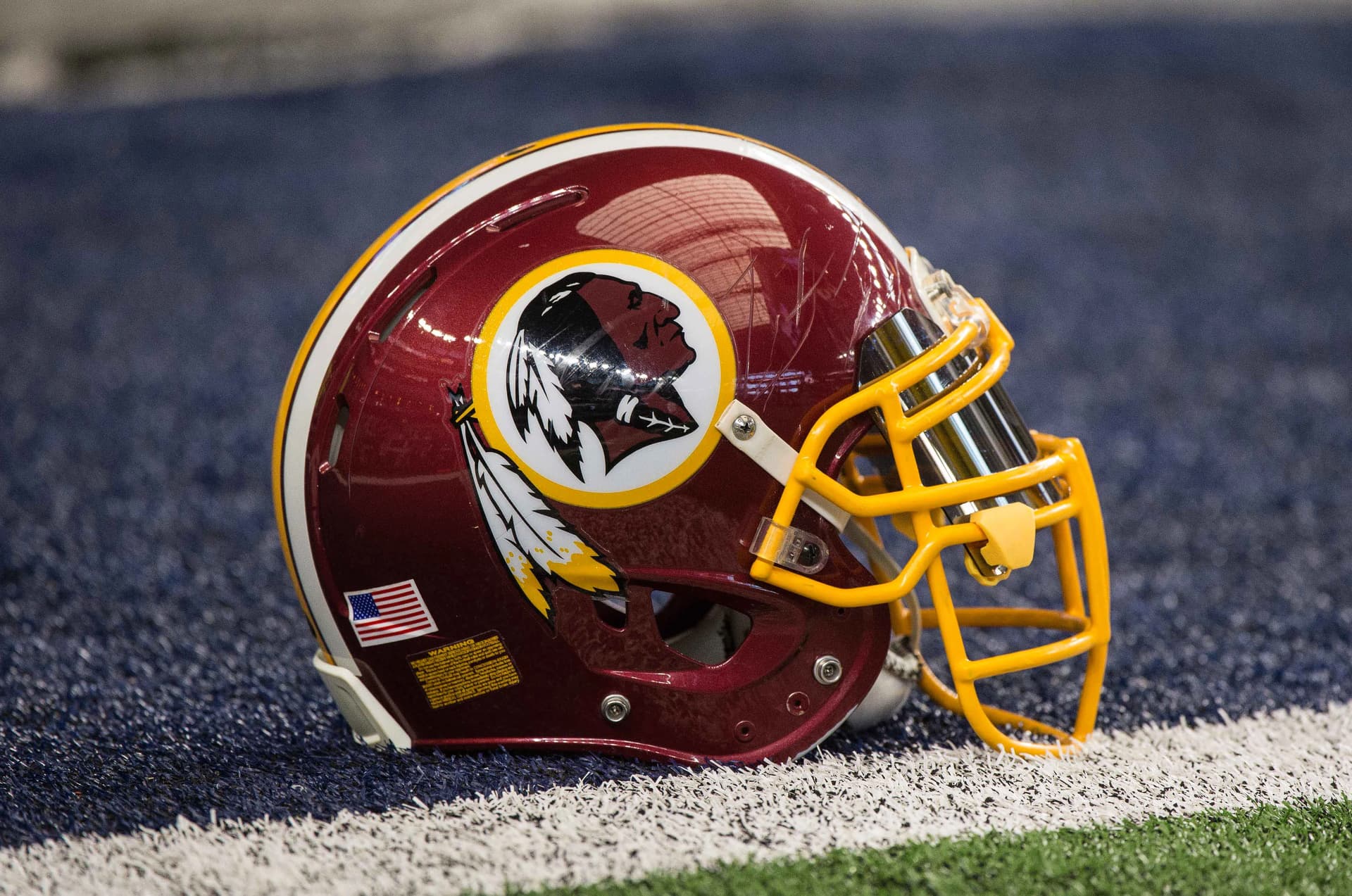
So many are out of circulation: Lions, Pats, Bucs, Oilers, and Broncos are so badass.
1 Like
Need to bring back old school unis for a full year. I dig the jets, eagles, Seahawks,
1 Like
Founded in 1876, won their first Canadian championship in 1898.
I know, right? Most think of Canadian football as just a spinoff from the US game.