1 Like
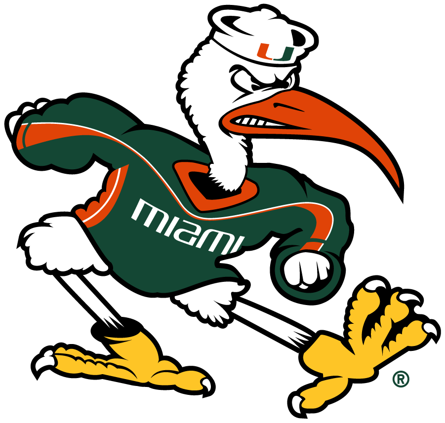
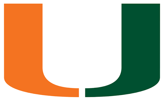
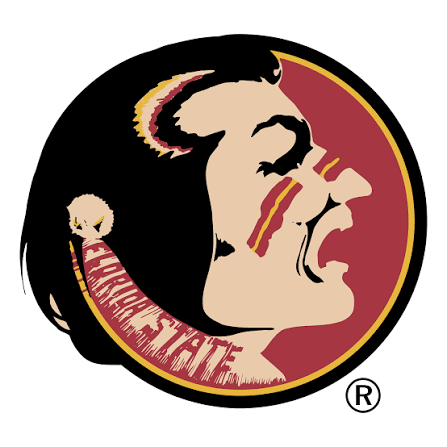
College football logos are unmatched
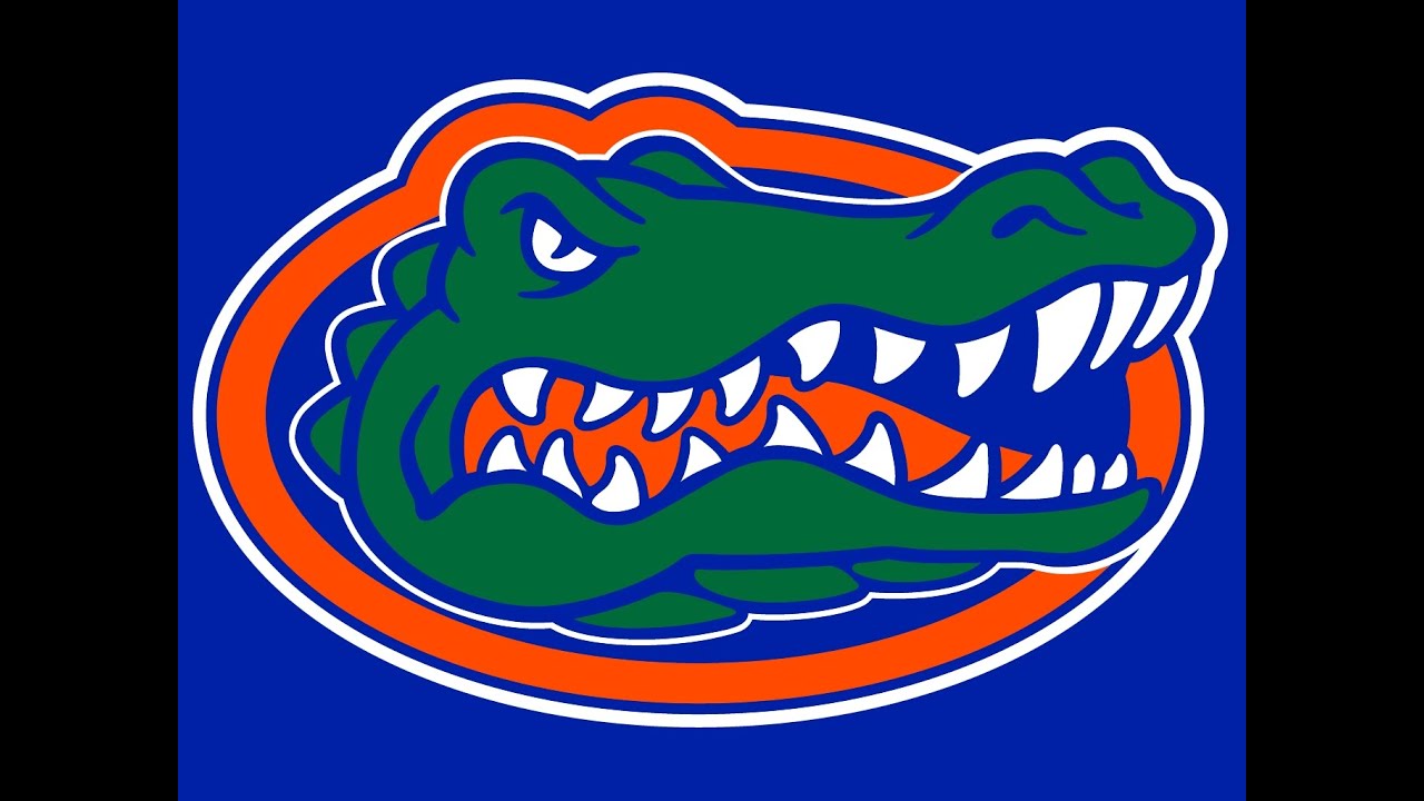
Specifically those from the state of Florida & Michigan

Glad you narrowed that down. My mind went to hockey.
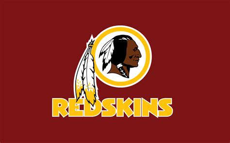
Being a Pontiac kid and seeing images of Chief Pontiac all the time, I find the Redskins logo to be one of the better logos in NFL history.

1 Like
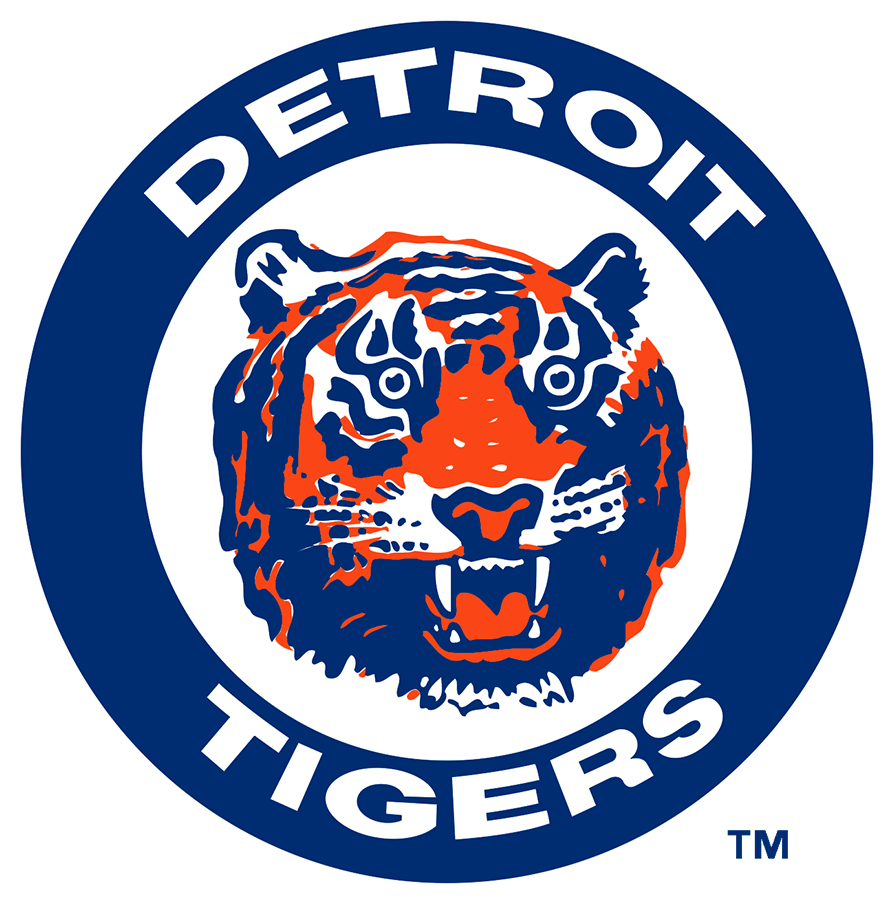
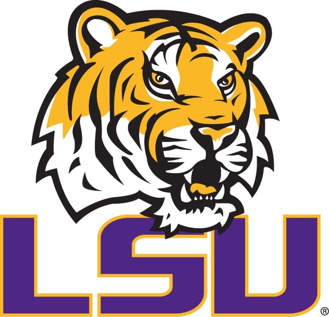
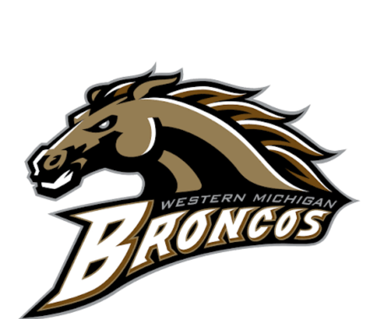
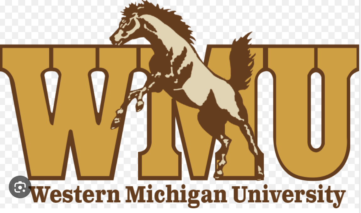
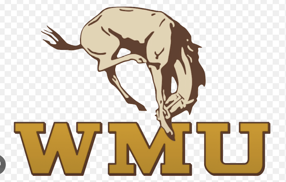
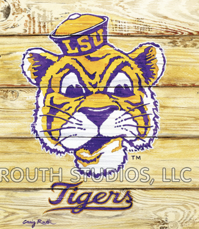
Eh, that LSU logo is just a generic Tiger. I like the rest though. That said, the old WMU logos were better. They tried to make the new one look too fierce, makes it look like a cheesy cartoon.
2 Likes
I like the tiger and color scheme. Also side note, I went to the LSU against Tebow Florida Gators team back 15 years ago.
Tigerland at LSU might be the coolest place I’ve ever seen on campus for sports bars tailgating football community. So I am a lil bias there.
The old WMU logos are sick I’m surprised anyone remembered those they didn’t go to kzoo.
The logo I posted was MY logo.
The motto “win or lose we still booze”
U of Mich logo is meh but the helmet . Elite A1

2 Likes
Hate to tell you this but their not 1st team to have that design. Infact at one point osu and msu had it before them.
Since everyone is veering off of NFL teams…. The Wings, Leafs and Rangers logos are better than anything in the NFL, IMO.
1 Like
third one from the Wayne Fonts era?
1 Like
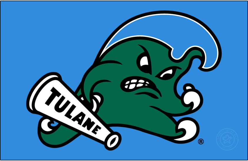
Is that an angry booger?
3 Likes
lol it’s the Green Wave!
1 Like
Lol, the Tulane Phlegm Wads
That was my handle on the old bar trivia systems that they had 15-20 years ago in places like BWW. It was the worst word I could get through their filters.
1 Like