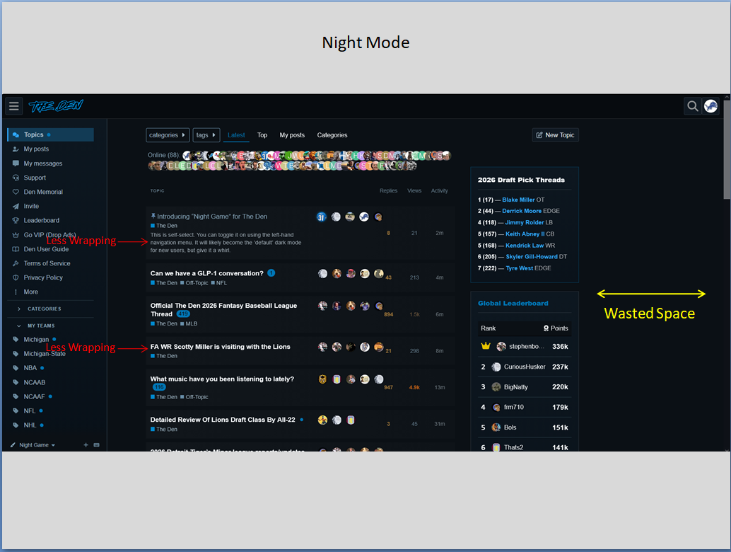
This is self-select as I debug. You can toggle it on using the left-hand navigation menu. It will likely become the ‘default’ dark mode for new users, but give it a whirl.
Beautiful. But I know there are some sick bastards here that are going bypass both dark and night mode to have their retinas burned out by the default white.
3 Likes
Den Goth is the best kind of goth.
2 Likes
I don’t see it on my iPhone… ![]()
Awesome. I like it. I’ve been operating in Dark Mode anyway, but this “Night Mode” is even better.
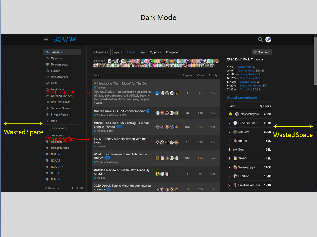
I also like how when in this Night Mode it moves the left hand menu all the way to the left of my screen and stops the double lining of the Topic/Thread names for the most part. So a little less cluttered. Now if we could just get the Right side where the new “Draft Pick Thread Shortcuts”, and the new “Global Leaderboard” to shift all the way over to the Right Side of the screen that would be great IMO. To me, that would stop the Topic and Thread text from wrapping down to the next line so much.
But hey, either way, this place is great and I appreciate all the efforts to keep it up and running.
3 Likes
Seeing the same thing on the right side margins.
Fixed.
1 Like
If you mean the thread links & leaderboard, that’s intentional. Content shouldn’t change, only layout/color.
To try and clarify.
the links and leaderboard are overlapped by the thread columns. IOW, to make it more confusing as I try and explain, the the thread column is hiding some of the verbiage in the links and leaderboard content, overlapping them.
Hope that clarifies a little
Ah, your monitor is probably a bit narrow. I’ll try and adjust.
Your image in the first post shows no overlap anywhere. I don’t have that in my view. I have played with text size with no impact
It does that for me in dark mode, but thankfully, not in night mode. Night mode rocks!
should be fixed now. refresh.
This is what I’m referencing.
But yeah, I guess it could be different based on screen ratio sizes. So maybe I’m the only one that sees it this way.
haha I’m a sick bastard I guess but I only run my phone and tablet at about 15 percent display brightness. So no big deal.
The Den default dark mode will be getting full width as well. Just haven’t gotten around to it yet. Probably by tonight.
As for the right side: it’s only wasted space because you have a larger monitor than most. There’s things we can do to address that space.
LIKE MORE ADS.
Just kidding,
Or maybe not.
2 Likes
Did this change the header on mobile? I used to be able to scroll up just a little bit and then the header would appear and I could click “the den” and it’d reload the main page… Now I need to either click back and then reload or scroll allllllll the way to the top to see the header again
Sweet!
Hey!! My retinas are healing!! ![]()
Also… As I scrolled, it used to show the number post I’m reading “out of” the total number of posts in the thread… Now that’s only appearing at the very bottom after the last post… Just noticing a few little things that have changed