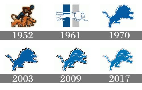
So lions basically had 5 options.
The original logo with the yellow lion
The one they used
The ugly leaping lion
Current lion
Or NO logo.
I think given the choice they chose right
So lions basically had 5 options.
The original logo with the yellow lion
The one they used
The ugly leaping lion
Current lion
Or NO logo.
I think given the choice they chose right
Love the color, dislike the logo.
Looks like if won a grade school design contest
A lot of people don’t like the grays
I like them ![]()
I like the nod to the past with the old logo
It looks like a lion with full blown AIDS.
I think the negative reactions to the logo itself are strange. It’s a classic logo. And the lions have been selling gear with this logo for years. It’s odd that a lot of people are acting like it’s the first time they’ve seen it. Now, it’s combination with the blue helmet to go with the all grays…people will have lots of opinions on. I like the matte paints, but I feel like the colors should have been reversed if they are going on the all grays
People will overlook these facts and continue to whine about the logo. When in fact they didn’t have many options
I agee. I think the helmet pops off of the grey. It also makes the blue highlights in the uni pop too. For an alternative it is both new and retro. I dig it. We will see it how many times this year? Probably 1 time.
Really, no other options except the 1952-1960 one.
That makes it make more sense, still doesn’t make it better lol
Personally, I would have put the 1961 logo in a circle and made it a lil smaller while on the helmet. I understand the concept but I don’t believe they put a lot of effort into it. This concept and design could have been put together in a day.
Again, I’m not expecting much from the new uniforms. I think they are afraid of change.
My thought as well.
You are right, they have been “trying” to sell stuff with this logo for years. You almost never see it…and I’m guessing because it’s terrible looking. I can’t think of a worse logo on a helmet in the league right now.
Bro, I have a dope hooded sweatshirt with that logo on it.
…also…I look handsome AF in it.
I have a jacket with the logo on it. It’s also dope, and I too am a sexy beast in it.
I’d imagine Ford Field would get a new banner if we accomplished that!
The logo wasn’t great then, but the Lions were actually good, and won championships in the 50’s! Should have went with that.
Way up the thread I mentioned a Denster that posted a pretty cool helmet design. Akin to the new Browns one. Well, found it.
Problem is they weren’t allowed per the No Fun League police rules. Maybe next year.
^^^^
If this was directed at me, why?
I was merely saying that you pointed out a very cool concept; however the league wouldn’t allow it. That was all. I appreciate you finding it. Just can’t happen on this helmet.
Enjoy retirement, would ya? ![]()